10 Examples of Websites moving Business Online during the Covid-19 shutdown&the sucessful Web Design during Coronavirus Strategies they are using.
1. Porto's Bakery
Make it easy! Porto's bakery of Burbank and Glendale, has mastered moving their business online during the "stay at home" orders.
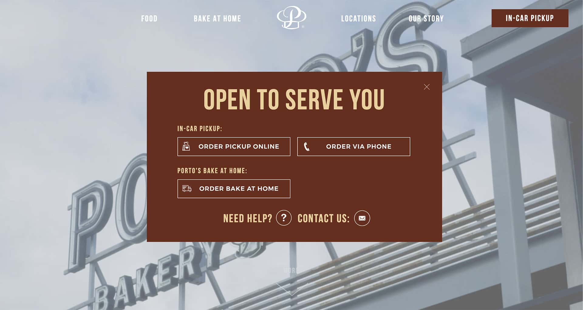
Porto’s Web Design during Coronavirus strategy is working particularly well. Their web design during coronavirus makes it easy to navigate, to understand ordering options, as well as to order.
1. The homepage is simple and clean.
2. Their choice of placing the pop-up, front and center, makes it obvious there are 2 options for their customers: In-Car Pickup & Porto’s Bake at Home.
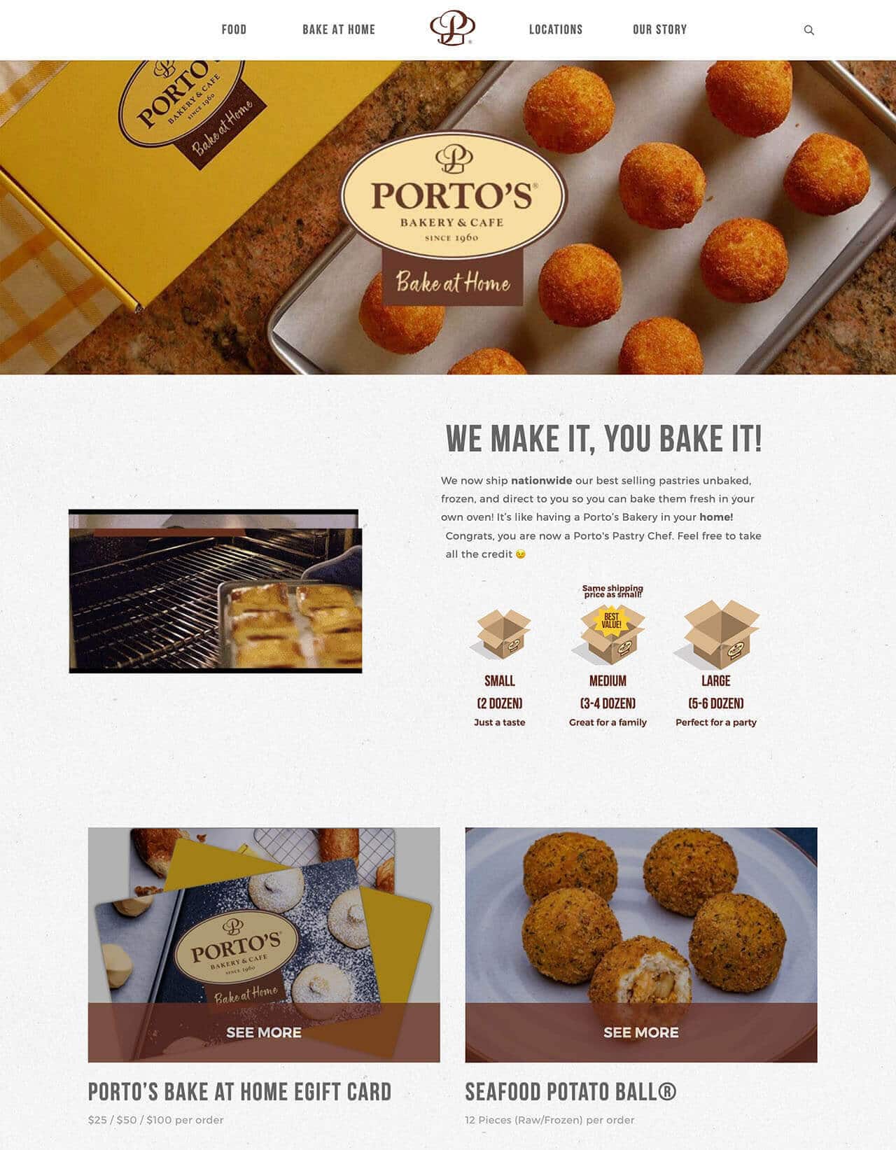
3. All the baked goods available for home delivery are displayed on this “Bake at Home” page.
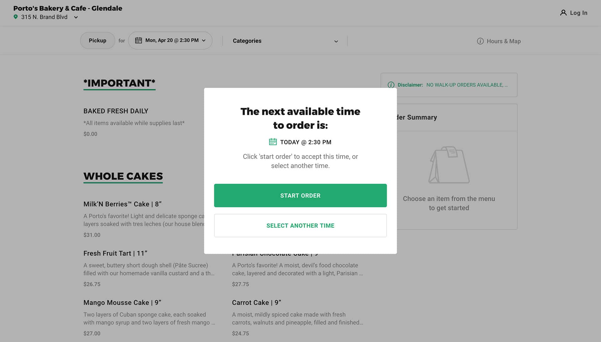
4. Porto’s bakery again makes it easy for customers to order online for in-car pickup.
5. The “order pickup online” button gives a set of ordering instructions taking you offsite to the ChowNow.com ordering app for Porto’s.
6. Immediately you are directed to select a pickup location, given the next earliest pickup time, and then given the menu of pickup items available at that location to order.
2. Hedley & Bennet
Shifting production! This is a beautiful website, and Hedley & Bennet has shifted their kitchen attire production to making masks.
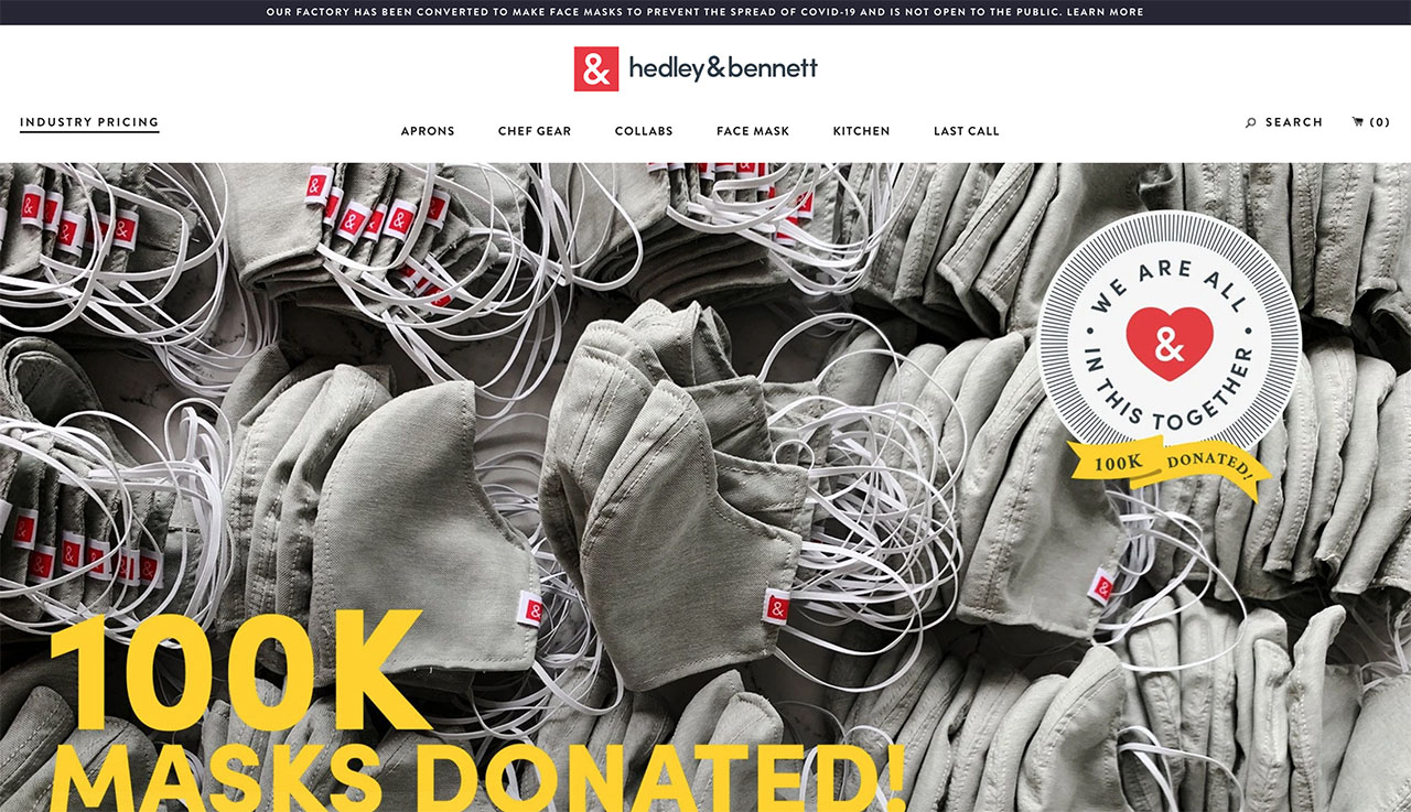
1. Hedley & Bennet added a beautiful slider to the page banner to promote their coronavirus face masks and donations.
2. A promotion bar at the top of the page is a useful space to make their businesses coronavirus operations announcement.
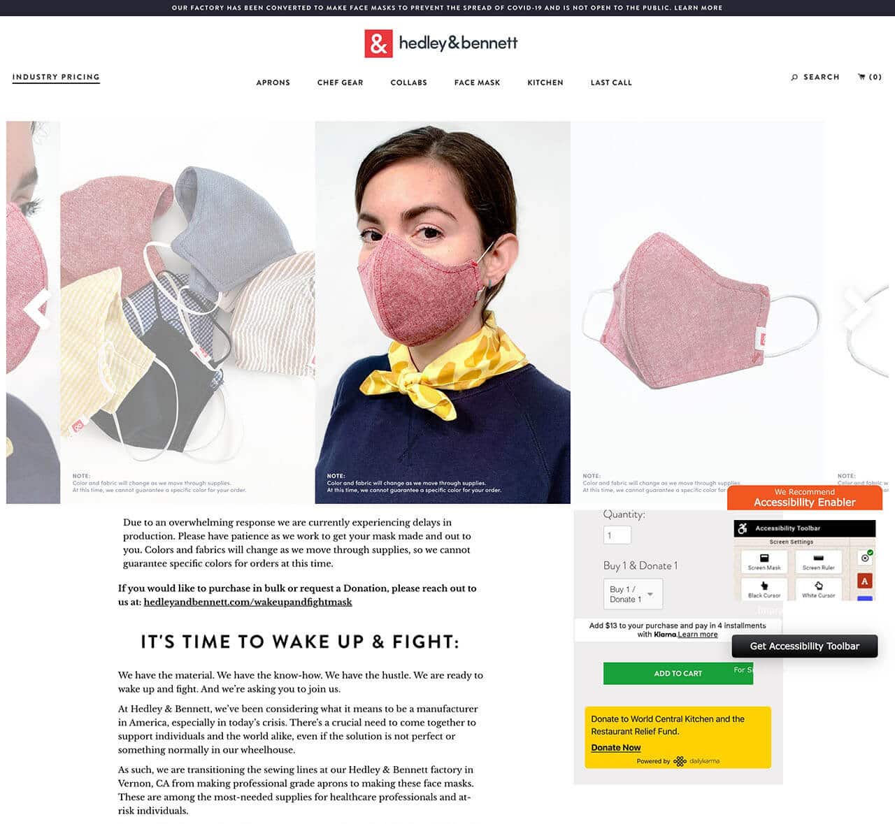
3. While there is a lot of text on Hedley & Bennet’s “The Wake Up & Fight Mask” page it is clear, well broken up, and easy to read.
4. This sets customer expectations for delays in delivery, explanation for lack of pattern choice, promotes that Hedley & Bennet developed these non-surgical masks in concert with a local surgeon, and explains that when you order one mask, Hedley & Bennet donates one mask.
5. Wisely there is a button to order on the right side of the page that takes you directly to the shopping cart.
3. DeLaurenti
Minimal and effective! DeLaurenti is a Seattle based Italian food & wine shop selling cheeses, meats & imported groceries plus a cafe for light bites. This is an example of a minimal but effective update to this shop's website for the coronavirus delivery.
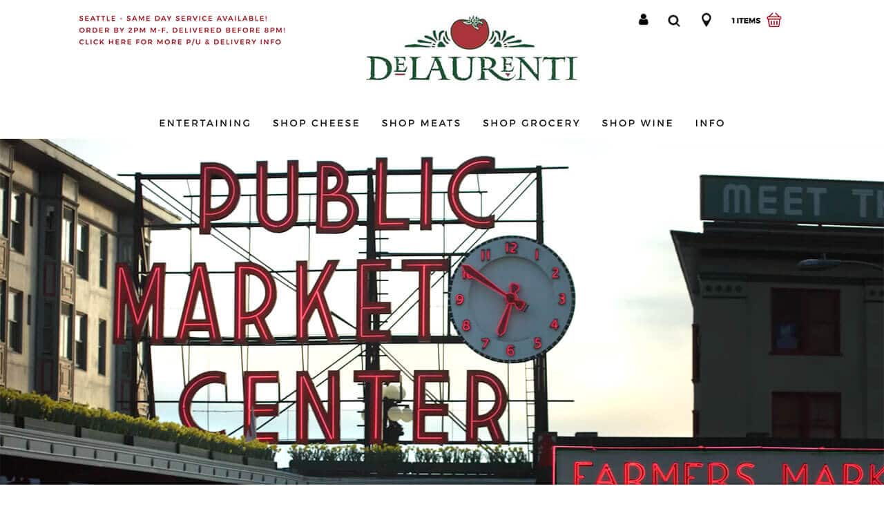
1. A header notice in an effective and minimal web design option for businesses. This notice informs customers of their local grocery delivery service on the upper left of the home page. Text is in red to get your attention, but still fits into the minimal style of their website.
SEATTLE – SAME DAY SERVICE AVAILABLE!
ORDER BY 2PM M-F, DELIVERED BEFORE 8PM!
CLICK HERE FOR MORE P/U & DELIVERY INFO
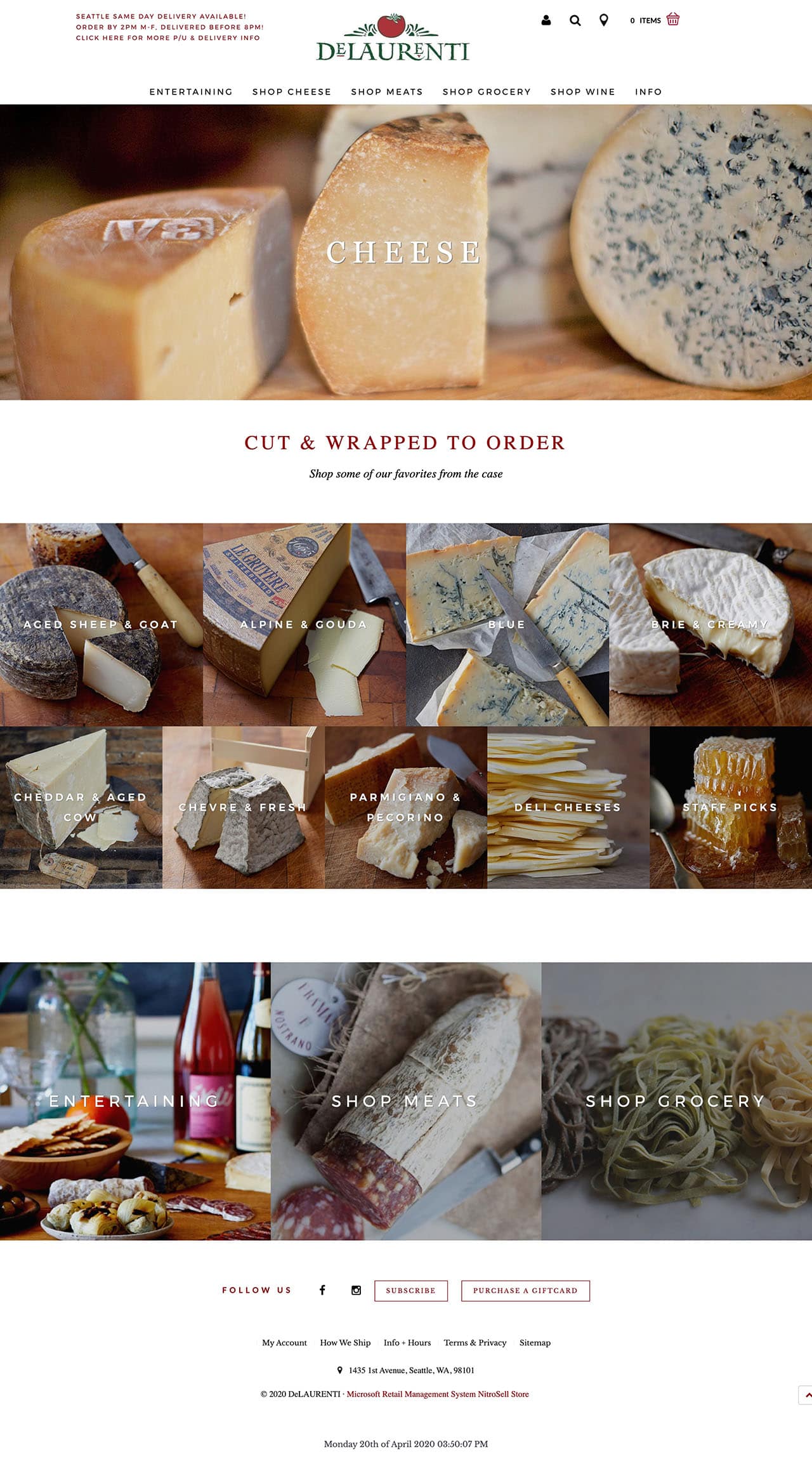
1. Beautiful photography and videography. When customers cannot come into your store and shop, it is even more important to have stunning photographs of their products. This website is a shining example of e-commerce website design. The website pages are laid out cleanly and simply. There are clean high resolution photos and video banners appropriate for residents of this high tech city.
4. All Time
Pivoting to demand! Normally an espresso bar & patio with breakfast & lunch options in Los Feliz, CA. They have transformed their business into a full-time marketplace with survival grocery kits, regular grocery items, and prepared food.
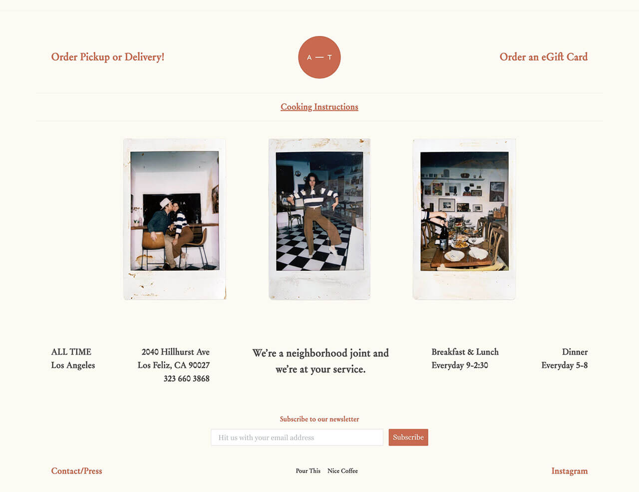
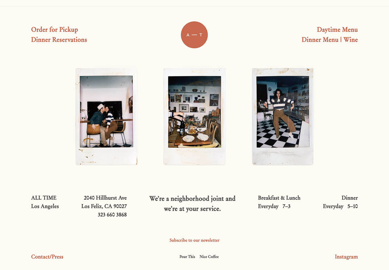
1. Another example of simplicity at its best. The “order pickup or delivery” on the top left corner is easy to find because the page is clean and not cluttered.
2. They have also added a helpful “cooking instructions” link below their logo.
Before and during coronavirus homepage images on the left.
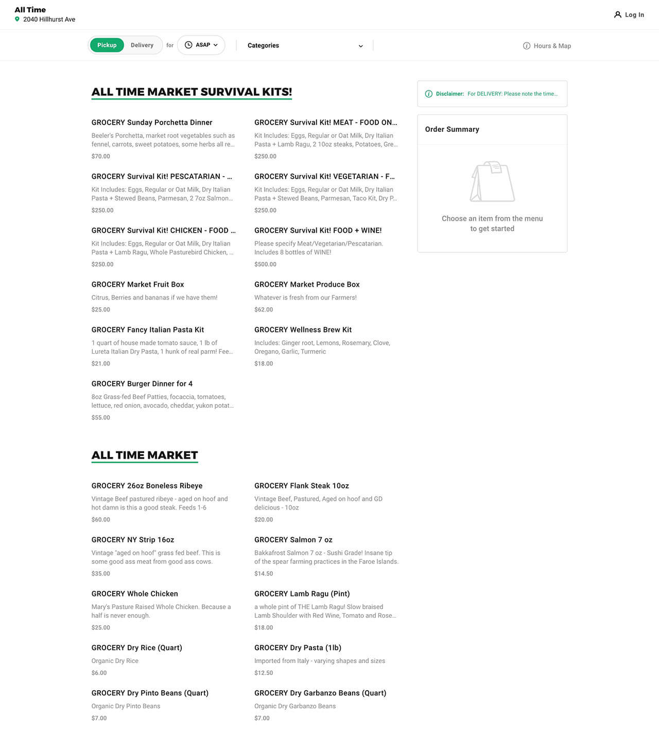
3. Easy Ordering. “All Time” has a link from their site to a menu on ChowNow.com. All menu items are available for order online as pick-up or delivery. The survival kits are clever, mouthwatering, and entertaining.
5. CPA Firm of Rene Sarkhosh & Associates, Inc.
Sharing your expertise! Restaurant and groceries are not the only businesses who need to update their web design during Coronavirus. Check out what this Los Angeles CPA firm is doing for their clients.
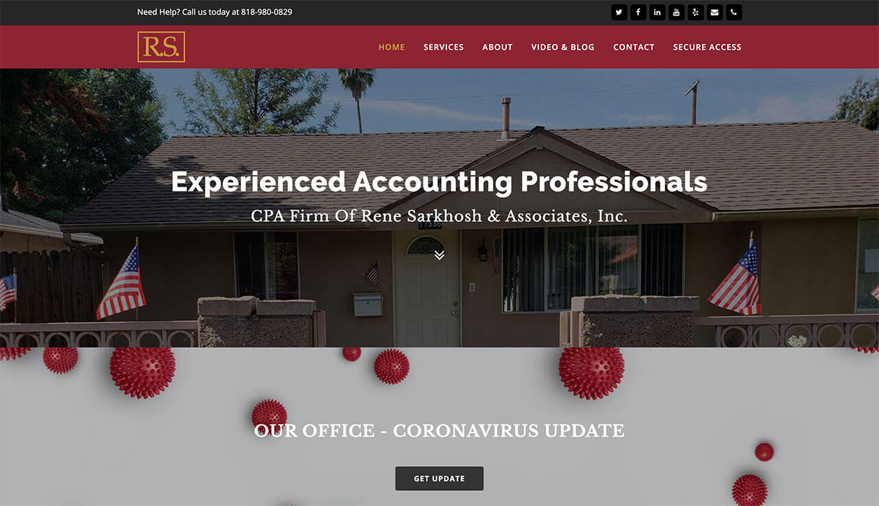
1. The coronavirus notice is below the header, but above the fold. At Guedin Designs, we updated the CPA Firm of Rene Sarkhosh & Associates, Inc.’s web design during coronavirus with a notice on the home page which is above the fold.
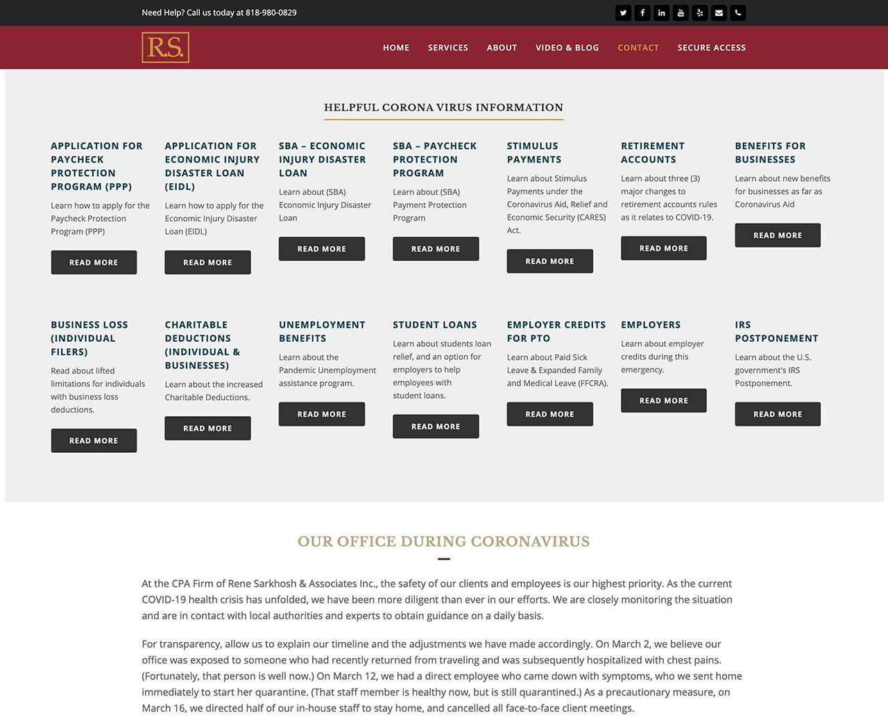
2. Blog posts. The “Get update” button on the home page takes you to their “Our Office during Coronavirus” page. Easy to find blog posts written by the CPA to help educate clients about the new Coronavirus tax rules, unemployment changes, loans, credits, retirement accounts, and stimulus payments for 2020.
3. Office update. Below these links is a status update of the CPA office during the Coronavirus shutdown.
6. The Butcher's Daughter
Resilience! The Butcher's Daughter is a Venice, CA vegetarian restaurant meeting demand by offering fresh produce and pantry items.
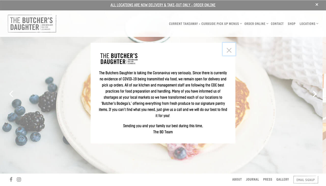
1. By adding a pop-up coronavirus notice customers receive a short update on their current services including delivery, pick up, fresh produce, and pantry items.

Before and during coronavirus menu images on the left

2. Simplified their top menu.
3. Added “current takeaway + curbside pickup menus”
7. L'Oréal
Giving back builds brand loyalty! L'Oréal has shifted production to hand sanitizer and hydroalcoholic gel instead of makeup and cosmetic creams.
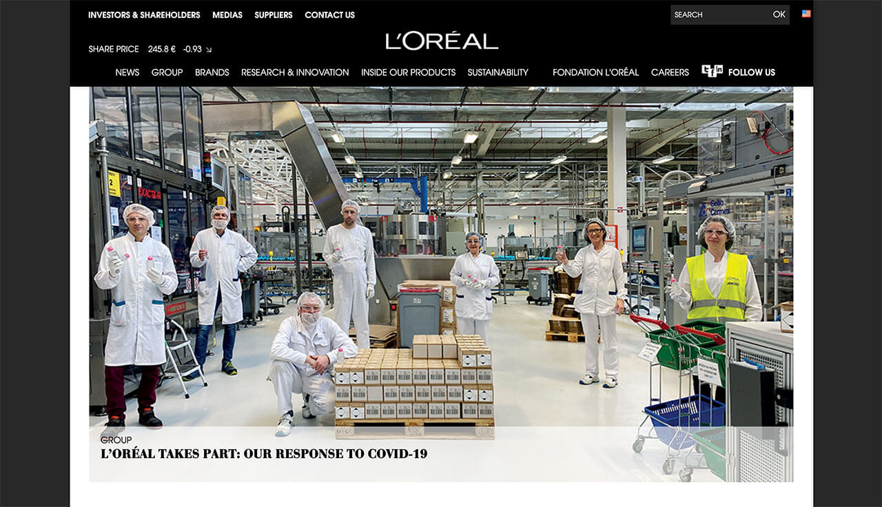
1. The full home page image features L’Oréal factory workers with their hand sanitizer.
8. Piroshky Piroshky
Build Trust! Seattle Bakery shares their Covid-19 sanitation strategy to build trust.
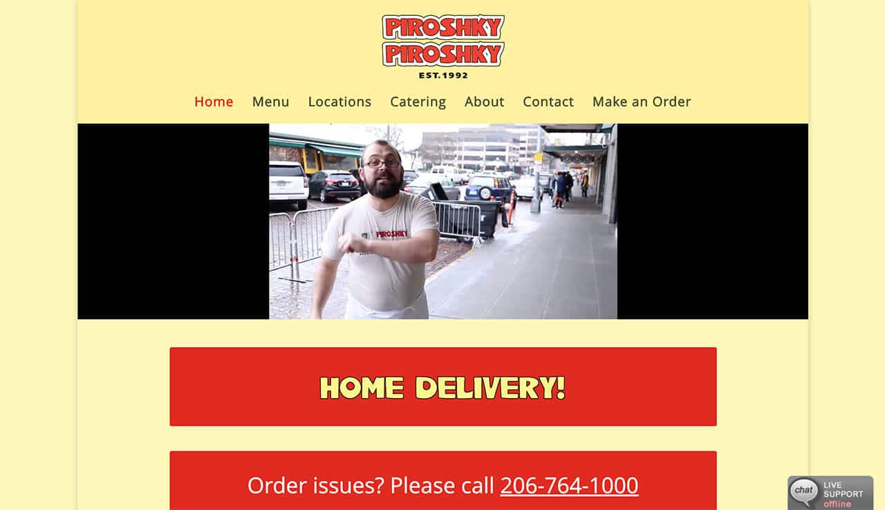
1. Above the fold video sharing the bakery’s sanitizing strategy to keep everyone healthy during the coronavirus. Thereby building trust with their customers.
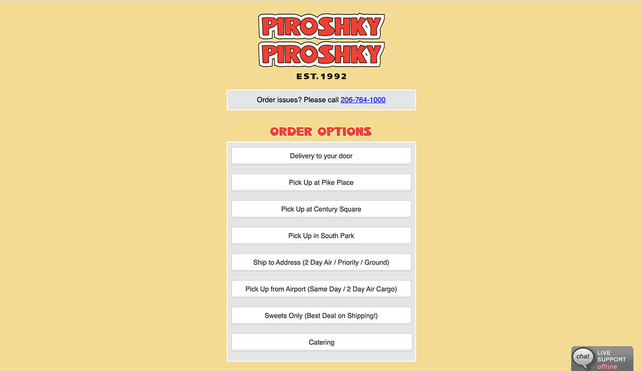
2. Every possible ordering option is made available to customers.
9. The Clean Masters
Answer questions online! Los Angeles cleaning company "The Clean Masters" is available for customer questions.
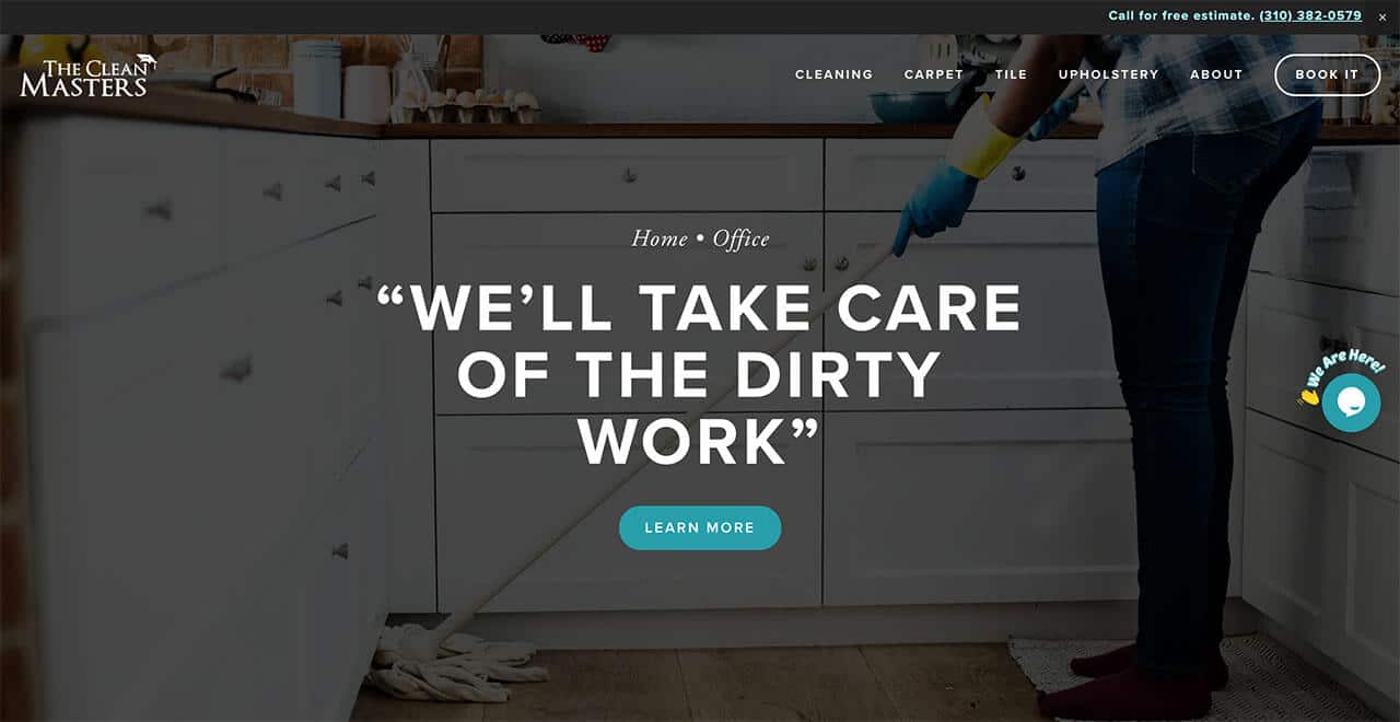
1. Chat service installed to communicate with website visitors. Guedin Designs installed the free chat service Talk.to for “The Clean Masters”.
10. Justin Roberts
Grow your audience! 3x Grammy nominated children's musician Justin Roberts is growing his fan base and social media following.
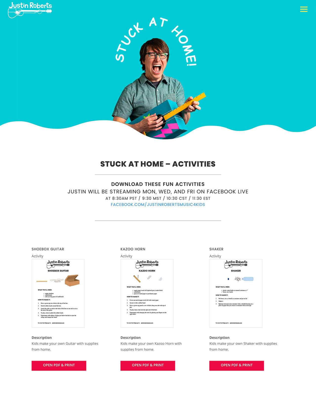
1. Justin Roberts hosts free Facebook live concerts for kids stuck at home. Times and links are provided on his website.
2. This “Stay at Home” page is a great web strategy during coronavirus. Here Justin shares coloring pages, activities, and sheet music with his fans.
3. He creates traffic back and forth between social media and his website which increases his visibility on Google.
Conclusion
Now is the time to pivot your business and meet your customers immediate needs. These ten websites are examples of smart strategic web design during coronavirus. I hope this article gives you ideas on how to market your evolving business through your website.
If you need website design help we at Guedin Designs are here to help you. Please use our contact form and we will respond within 2 business hours to your request.

Kim Guedin
Kim Guedin is the founder of Guedin Designs, and has 7+ years experience building strategic websites for small businesses. Kim stays up to date with the changes to SEO and design to benefit your business. To contact Kim, please visit our contact page.
